Whether in designing a home, a website, or a piece of art, the principles are always the same. You have to follow some basic rules, which are not a "must", but they help you to make a harmonic relationship between elements in your artwork. Knowing these principles, you can break a law now and then and make your artwork even more aesthetic.
Make your house look integrated
A designer can direct the eyes of the viewer through the artwork by creating a path from the most imposing part of the view to other parts. It makes the view much easier to analyze in the brain and more pleasant to look at as the result.
Make it rhythmic
Create the mentioned path by repeating colors or a shape in the elements of the artwork. Repetition in design is like pulsing, helps to create a feeling of an organized movement between focal points.
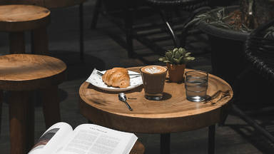
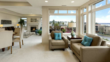
For instance, use the most dominant color in the rug in sofas' pillow or the throw. It helps the living room to look more cohesive.
Choose a color to use in all the areas to give your home a cohesive look. This color will be used together with its complementary color in 60 percent of the space. Then chose another pair for use in 30 percent of the space. And yet another pair for the last 10 percent of the room. I personally pick green paired with black or white because I like having plants in my room.
Using repetitive patterns of lines on a wall helps drawing attention to a frame hanging on the wall. In the form of horizontal lines, it can also make small rooms look bigger by giving a heightened look to the space.
Don't forget Focal points
Focal points are the elements of the design which attract the attention first. These elements are different in color, shape, texture, or size. They help to draw attention to an object in the artwork, usually the largest or the most detailed area.
Keep it unified
According to scientists, our brain prefers to get the simplest form of anything at a time. Using too many colors/patterns can be dizzying for the brain.
To make a simple yet attractive view, try to use materials that are in harmony together. It doesn't mean you have to use repetitive boring materials, you just need to pick different things but tied up with each other in some way. For example, objects varied in shape but with the same material or texture.
Pattern
You can make a monochromic-style room more interesting by using patterns. The result would be even better if you unify the room by use of repeating patterns. As mentioned before using repetitive patterns can be helpful to make a wall look more heightened. If you want your space to look bigger, then use small patterns.
Try to use patterns sparingly, to avoid overwhelming the space in small rooms. And to keep the room cohesive use similar patterns. For example, if your rug has a geometrical pattern, repeat the pattern on pillows or use it in the form of a feature wall.
Large-scale patterns also can flourish the room as a focal point by making a contrast between objects.
First, pick your style
The patterns should fit into the category of the style of the room. For example, if your room style is traditional, it's better to use incorporate organic floral prints, or geometric and abstract prints for a contemporary style.